First, the good:
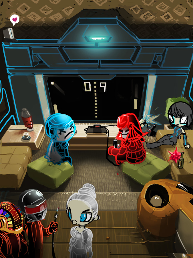
Lovin¹ the colors! I think the earth tones in the living room will really
let the figures pop out. The characters look like they¹ll fill out really
well, too. I¹ve only seen one Tron Legacy babe, and it looks like you
captured her perfectly. How about maybe adding in one more cutie, or two?
The concerns:
I didn¹t catch this the first time around, but being in color has helped
bring out a potential pitfall. At this point, the Recognizer tv screen is
half the image. All the other components are dwarfed by it, and it¹s the
other components (especially Flynn and Sark) that should be getting more
attention. Can we make them taller/bigger? If we need to, we could push the
Recognizer a little further back/up since we have some room at the top that
the wallpaper is taking up (nice pattern by the way!).
Smaller changes:
I get the reference for the Daft Punk outfits. Let¹s keep the outfits, but
change the helmets to look like these:

Production issues:
Is poster size too much?

-Ok. I upsized the characters and slightly scaled down the enforcer. I do like his monolithic size, so I took the focus off him by dropping him down a couple notches in scale and also in value. I also gave him space on his sides so he's part of a wall instead of A wall.
-I also made the 'bit' drinking a beer. IDK what yet, likely I'll switch to martini, because that seems more high class and I imagine this particular bit to be of privelaged upbringing.
-Speederbike looked dinky to me and everything was evenly sized - fixed that.
-I WAS going off a picture of tronstyle Daft but went with the classic helmets. I'm a bit torn but I'll go with the shiney ones cause I like chrome lately.

-On adding another character, i'll see if I can fit her in without cramping it too much.
oh ya - and poster size? werd. Canvas size is now: 5400x7200
be seeing you,
&Rew.
No comments:
Post a Comment